 There are many reasons why Instagram worked: timing, mobile centric, the ‘limitations’ (iOS only), the design and logo were/are retro, warm, and appealing.
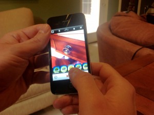
But I think the primary reason Instagram worked were the filters. For the first time the masses like me, who’s only knowledge about photography is how to press the button, were able to see, without opening up some complicated program, what professional and creative effects could do to their photos. And it was one click. When you snapped a photo with Instagram you could either post it as is, or there were a row of 9 or so “filters” at the bottom, “pre-sets” if you will, that you simply selected and it would automatically apply them. These filters were imitations of what the pros spend hours doing in Photoshop. And suddenly the masses had them at the click of the button. This is the same appeal that photo editing apps for the iPhone like Camera+, Best Camera, and Camera Awesome have: Simple, easy, and fun photo editing that is merely the click of a button to get a unique effect.
Limitations are Freeing
I was thinking about this as I’ve begun using Garageband for the iPad. It’s much more limiting than Logic Pro or even Garageband on OSX, but I’m being a lot more productive on it and having a lot more fun. The nature of mobile is intimacy and ease, which equals in a lot of cases increased productivity.
In Instagram’s case, it didn’t have as many filters or options as Camera+, but that limitation made it much more easy to use and much faster to use. To be fair, Camera+ wasn’t trying to be a Social Network, and the app was very successful in its own right simply selling on the App store. But in Camera+’s case and Camera Awesome, after you take a photo, the damn thing disappears! Then you have to go find the little thumb nail of it, re-open it, and then when you go choose the effects, and this is key, what you see are the pages of effects and not the photo. So then you have to apply the effect, wait while it generates, and then finally see if you like it. Whereas with Instagram the original photo is up on the screen at all times and the selections are at the bottom. You can breeze through sampling all the selections and see them immediately. It makes the whole process easy and fun. To be fair I love Camera+ and Camera Awesome and couldn’t recommend them more, but I’m just simply pointing out a couple frustrations with them, and why Instagram out paced them in use and adoption. (To be fair though, like I said, Camera+ wasn’t intending to build a Social Network.)
Being Mobile Centric and only Mobile centric: You can’t look at photographs on the website. The only thing you can do on the website is sign up for an account, is another limitation. Some would say, frustrating, but actually that limitation, in the minds of many, was rather intriguing. If you wanted to see an old photograph, you had to search like an easter egg hunt for the link on Twitter or wherever you posted it. While the developers probably didn’t intend it, they merely were trying to save resources for their primary target, that limitation as well as the limitation of being iPhone only, created a sort of caché in the mind, especially in those of the hipsters, a lot of whom happen to be the biggest influencers on Twitter.
To be fair timing was a key too. At the time, Twitter didn’t have it’s own photo sharing service, and the third party ones that existed just really looked awful and contrived. They were so ugly they conditioned you almost to not want to click on a photo link. So when Instagram launched with it’s beautiful design and hipster appeal, Twitter adopted it as its de-facto photo sharing service, and Instagram rode that wave to mass adoption.
